


Are your products sold online? You need optimized pack shots.
How GS1 Mobile Ready Hero Images transform mobile eCommerce

If you are going to show me a new product, show me it on mobile or get out of my office.
Mark Zuckerberg
Mark Zuckerberg already knew back in 2014: more and more of our online activity is taking place on mobile devices, with screens the size of a human hand, or smaller. Just look around. When you catch people waiting, even for a few seconds, a large percentage of those present will assume following pose: heads down, gaze loosely locked onto their device, faces illuminated by the blueish glow of its display.
They are not all going through an endless scroll on Facebook or watching puppy videos. They are also banking. And they are shopping. Boy, are they shopping.
Mobile payments [1] were up a whopping 42% on Black Friday 2018 vs 2017. 90% of consumers say they use multiple devices to complete everyday tasks, while 40% say they use their mobile device to conduct research prior to making a purchase. [2]
There is no denying: eRetail is going mobile. When it comes to visually presenting products, this brings a set of specific challenges for brand owners and retailers. Simply scaling down a standard-size image will not work.
To help companies with a unified, consistent approach to presenting products for eRetail on mobile devices, the GS1 released the mobile hero image guidance document in August 2018.
GS1, a non-profit organization that builds global standards for use in the supply chain, is probably best known for their harmonization of barcodes; GS1 barcodes are scanned 6 billion times a day.

Its global standards system, however, goes far beyond the humble line-and-space pattern on pretty much everything we buy. Their standards are used by countless companies, including well-known brands, multinational retail chains, and local shops.
Consumers need to know
Consumers need to know all they need to know when they click the "Add to Basket" button. On mobile devices, however, this proves to be a challenge: as the images are scaled down, the first thing to go is legibility. Virtually all indicators of the required information are reduced to a few indecipherable pixel patterns.
In an ideal situation, consumers would be able to understand, even at a quick glance, four key pieces of information about the product they are considering buying.
The 4 Essentials
When buying products online, we need to be able to see certain product information at a glance: which product it is, which variety it is, which brand produced it, and how much there is of it. If these 4 essential pieces of information are unclear, customers will not receive what they thought they were going to receive, and the mCommerce retailer will have a greater likelihood of reverse logistics when customers want to return products to the retailer.
The hero emerges
The GS1 Mobile Ready Hero Images Guideline seeks to standardize the way in which we present products for ecommerce on mobile platforms, sometimes called mCommerce.
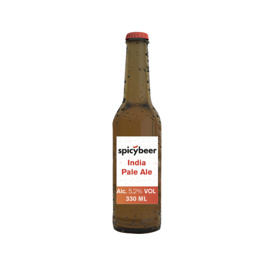
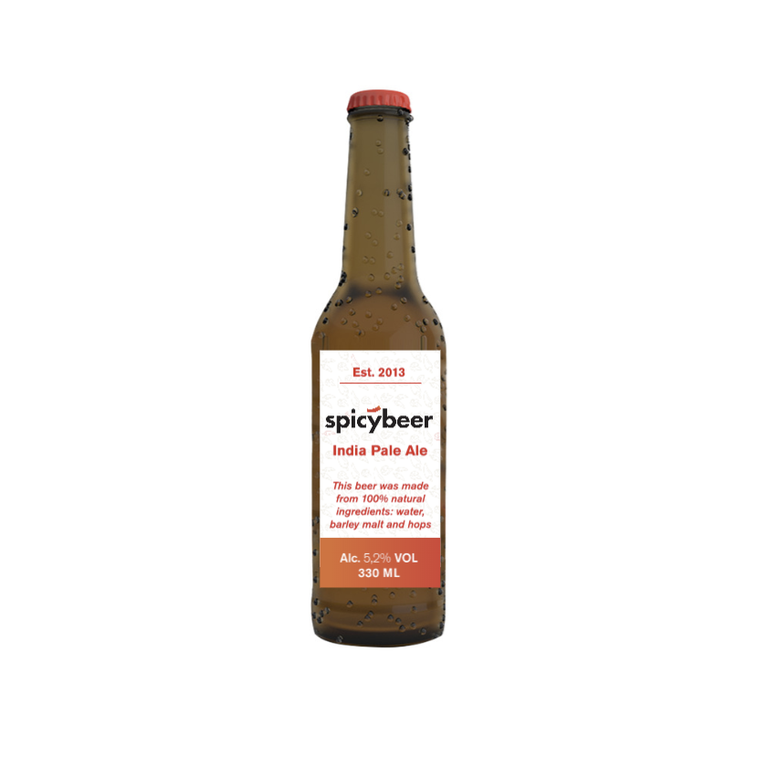
Mobile Ready Hero Images are special versions of a pack shot that make the key information clear on limited screen real estate. They are decluttered and enhanced product representations, that convey the 4 essentials clearly.
Each element in the mobile-ready hero image must contribute to product recognizability. If it does not, like illegible text, it can be removed safely. The essentials - brand, product, variety and amount - can then take up the vacated room on the digital pack and grow larger. Sometimes, however, decluttering and enlarging is not enough, and one or more of the 4 essentials needs to be moved off-pack to ensure recognizability.

The mobile-ready hero image canvas
When presenting products on a mobile device, there are certain restrictions that dictate how much real estate is available. The maximum area available for use is called the Mobile Ready Hero Image (MHRI) Canvas, and it may vary per online retailer. On this canvas, you’ll find all elements to clearly identify a product : the digital pack and off-pack elements.
The Digital Pack
A simplified product shot, optimized for legibility, the digital pack mainly helps consumers recognize your branded product, by illustrating the 4 essentials as clearly as possible. It should be as large as possible within the MHRI canvas and contain only the 4 essential elements.
Off-pack elements
Sometimes the digital pack has room to accommodate the 4 essentials. At times, though, there may be insufficient room on the digital pack to show them all. In such cases, you can display some of them off-pack, with a dedicated visual design element, like a bar, a disc, or a medallion.
Even if it fits, there may be other elements you want to show, like environmental claim logos of award medallions. You can present these off-pack. It is advisable to do so consistently. The mobile-ready hero image is an expression of your brand and is subject to the same brand governance as any other communication.
Creating a mobile-ready hero image
Building a mobile-ready hero image takes just a few easy steps:
First, you declutter the digital pack: remove all non-essential elements. This will free up space to make the essential elements larger, so they remain recognizable and legible when the image is viewed on a small display. Then, you create off-pack elements for the information that does not have a place on the digital pack.
In and of itself, setting up your own branded guidelines for creating mobile ready hero images is not that difficult. The sting is in the execution, though. Unless you apply some advanced automation to this process, it quickly gets out of control. To get an idea of how many versions are required, do some simple math: multiply the number of different mCommerce requirements and specs with the number of products, variants and sizes. It quickly grows to thousands of images, and any inclination towards manually producing them goes out the window. The only way to produce these at scale is with advanced document intelligence.
You could even go further and use a live connection to your Product Information Management or Digital Asset Management platform. Any changes to the product information or the assets used would then be automatically reflected in all variants of the mobile ready hero image.
Testing your Mobile-Ready Hero Images.
There are many ways of testing your mobile-ready hero images. The University of Cambridge Engineering Design Centre has a specialized tool for it.
If you want to test your hero images scientifically, you can blur an image in your image manipulation software: a Gaussian blur with a 34 pixel radius applied to a 3000 x 3000 pixel image shows you roughly what the image will look like on a 16 by 16 mm image on a mobile device at 40 cm from the user.
To get a quick and dirty indication: squint. If you can still make out the 4 essentials, you should be OK.
Here's the thing that amazes us most: all technology required to automatically build GS1 mobile ready hero images is available today. Most brands already have large parts of the required technology stack deployed today. Smart Templates are the keystone technology to bring it all together, however. These smart templates can automate most of the work to generate many different versions, respecting the GS1 guidelines and brand identity.
More info about the GS1 Mobile Hero Image guideline here: https://www.gs1.org/standards/Mobile-Ready-Hero-Image/1-0
Marketing

Piet Saegeman
Aug 16, 2019
Sign up for blog updates
Related articles

Brandwidth,
Marketing

Kees Henniphof
Jun 2, 2026

Product

Bram Verniest
May 1, 2026