


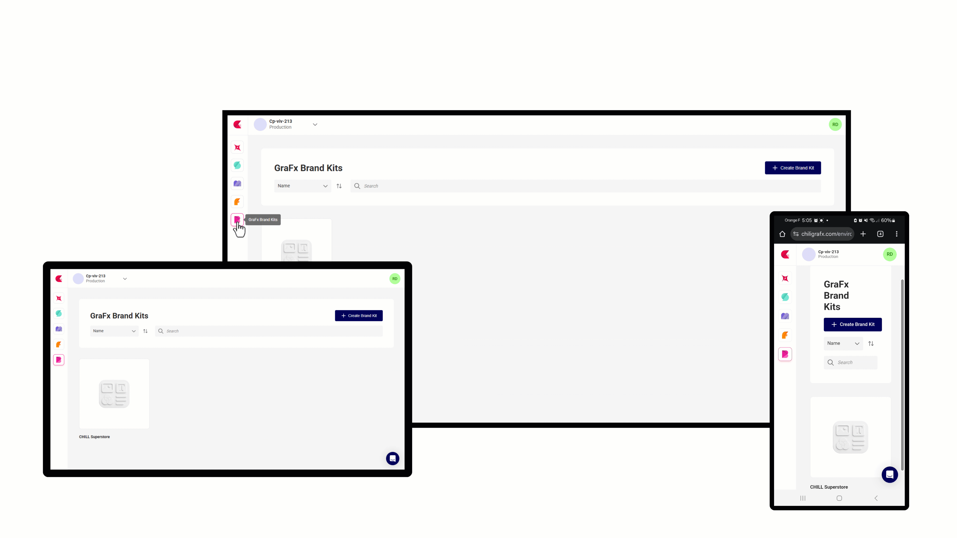
GraFx Brand Kits: One Brand Kit, Multiple Visual Identities

Most brands aren't a single, fixed thing. A sub-brand has a different accent color. A print campaign needs a CMYK palette. A regional market calls for its own visual tone. Until now, managing those variations meant duplicating Brand Kits or working around the system. GraFx Brand Kits now solves this with themes.
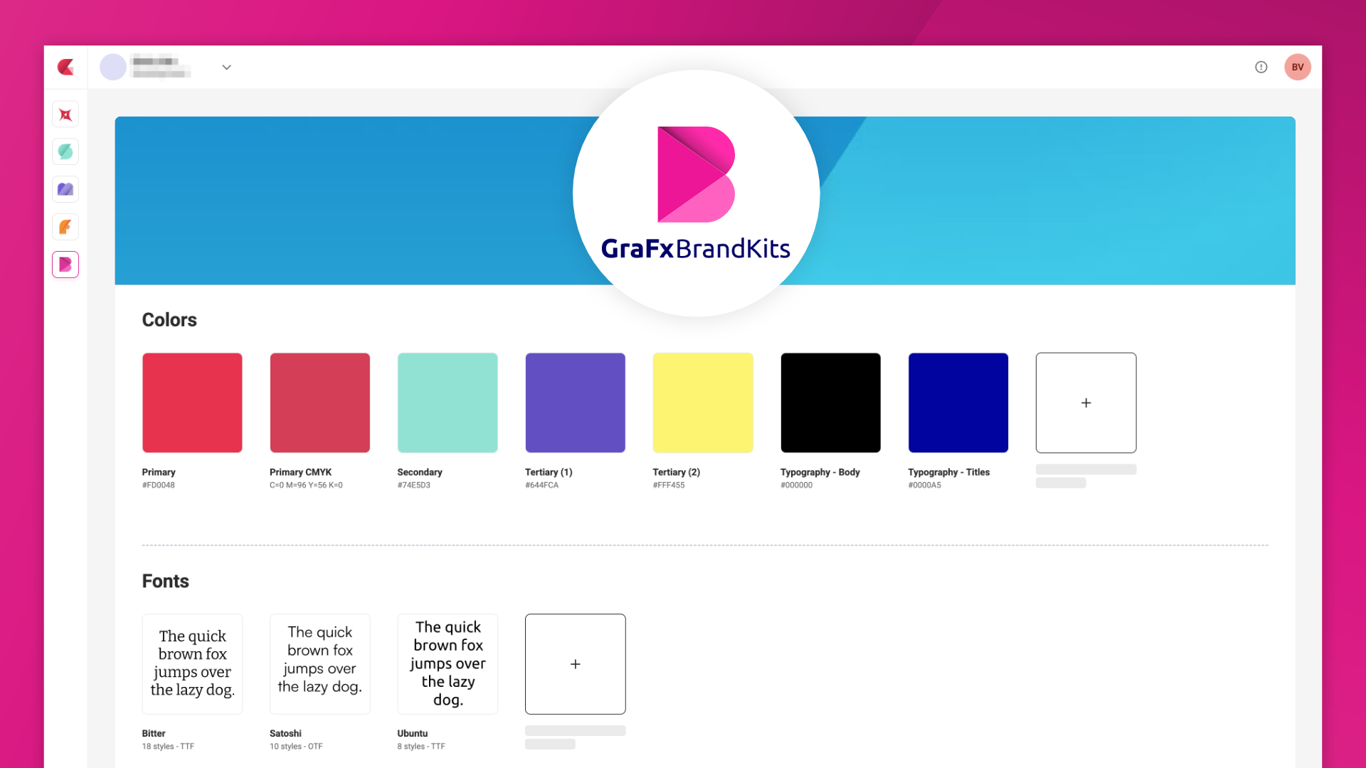
Brand Kit Themes
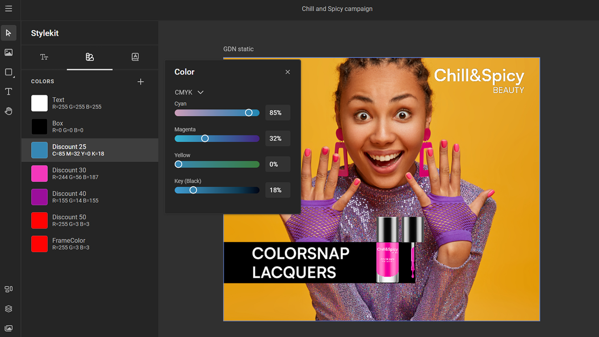
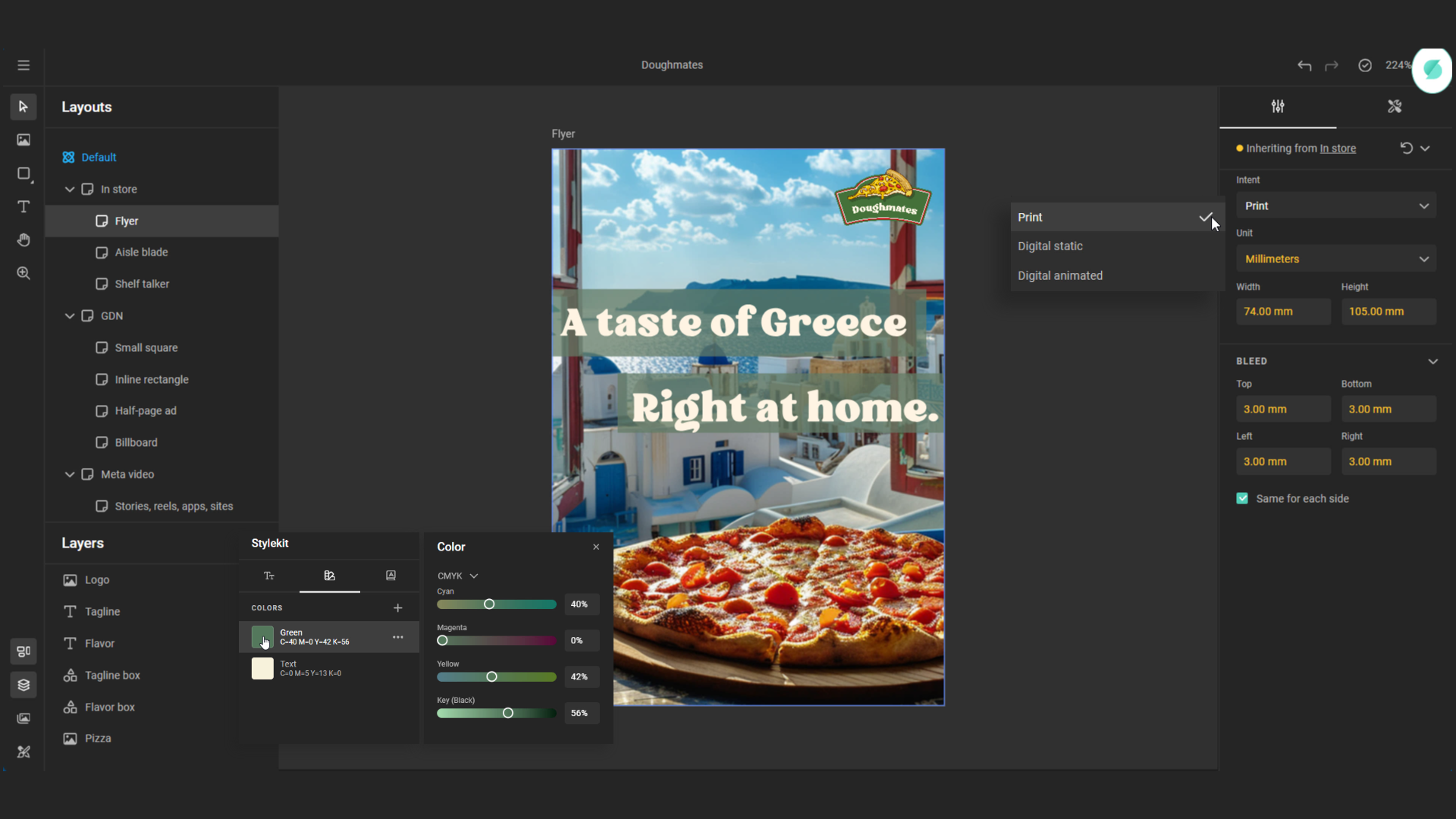
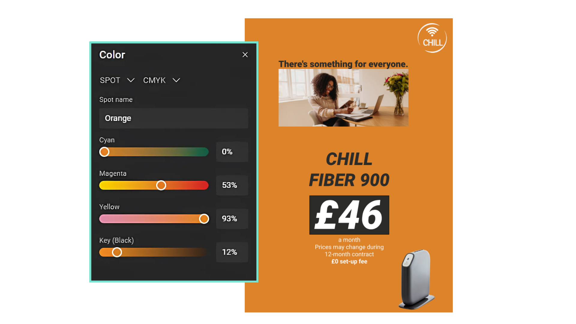
A Brand Kit can now carry multiple variations of your visual identity through themes. Every Brand Kit has a default theme containing the complete set of elements. Additional themes inherit everything from the default and override only what differs – a sub-brand accent color, a print palette in CMYK, or any other targeted variation.
Themes work across three touchpoints:
- Manage themes in GraFx Brand Kits: Create, rename, and delete themes from the new theme bar on the Brand Kit detail page. Manage themes
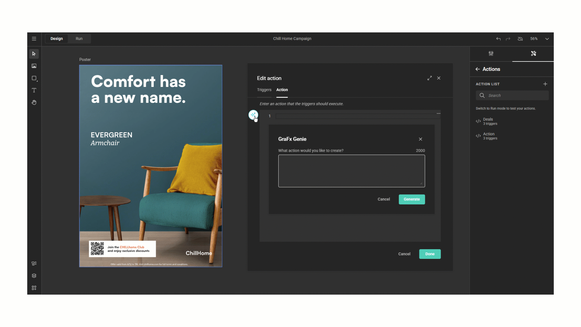
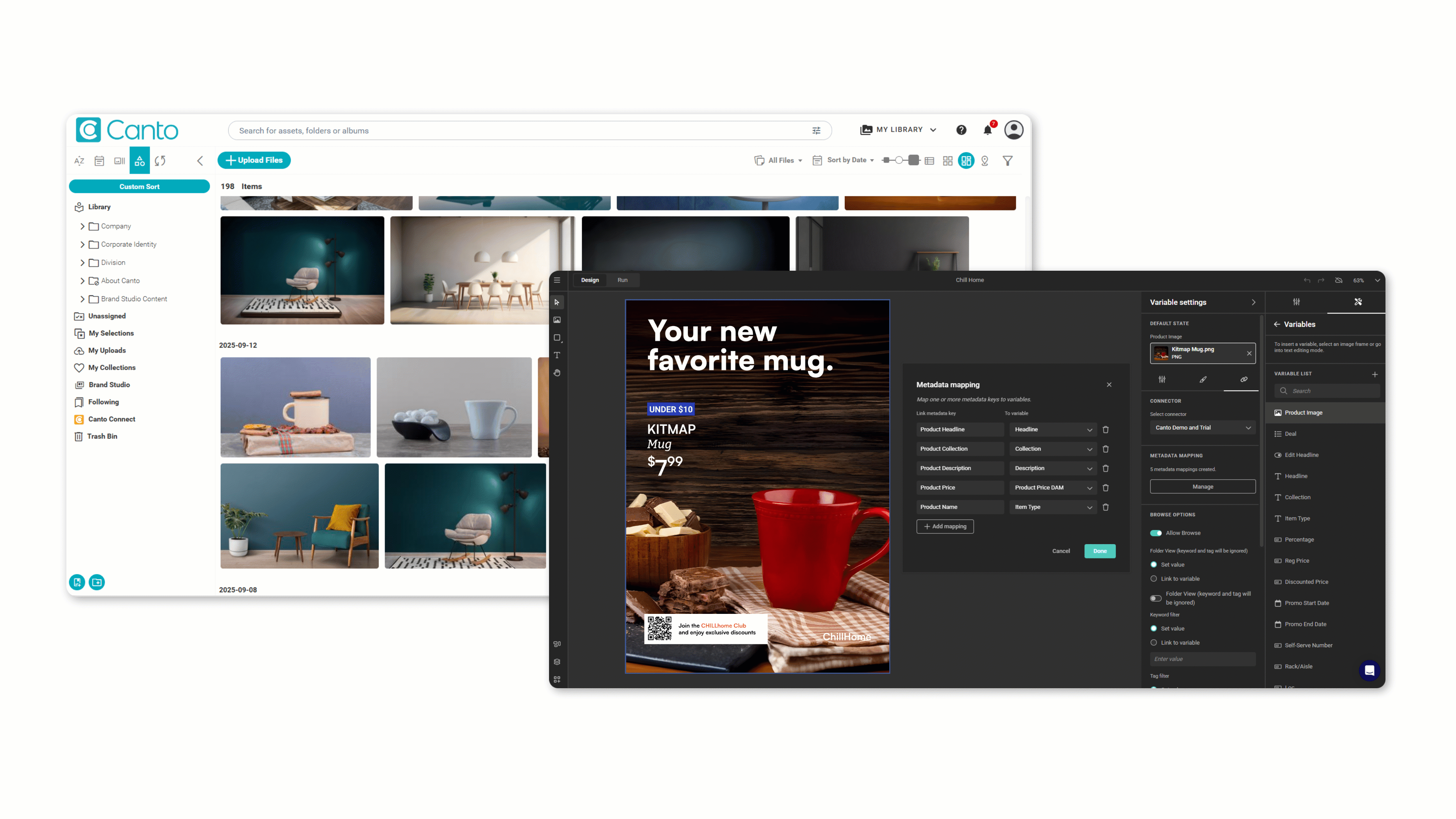
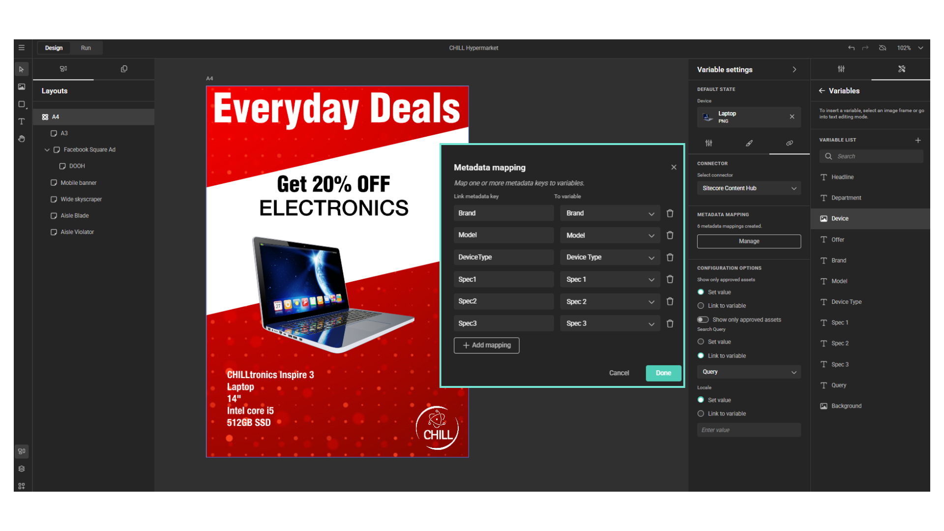
- Switch themes in GraFx Studio (Studio + Engine 1.45): The Brand Kit panel's new theme selector updates every Brand Kit element used in the layout, and sync is theme-aware. Switch themes
- Switch themes programmatically: New Actions helper functions getActiveThemeName() and switchTheme(name), or the equivalent Studio SDK methods, let you drive theme switching from automation logic. Switch themes with Actions or the SDK
For teams managing multiple brands, regional variants, or channel-specific palettes from a single design system, this removes a significant layer of duplication.
Read the Themes concept | Explore typical use cases
GraFx Studio Improvements (Studio + Engine 1.45)
This release also includes a set of GraFx Studio refinements:
- Heavy media assets no longer fail prematurely: Studio now waits up to 10 minutes for GraFx Media to process an asset before giving up.
- Font previews: An additional fallback ensures previews render in more cases.
- Undo and redo in text editing behave more predictably.
- Subject type fallback on asset details: When a custom subject type has no settings of its own, the default subject type settings are now applied.
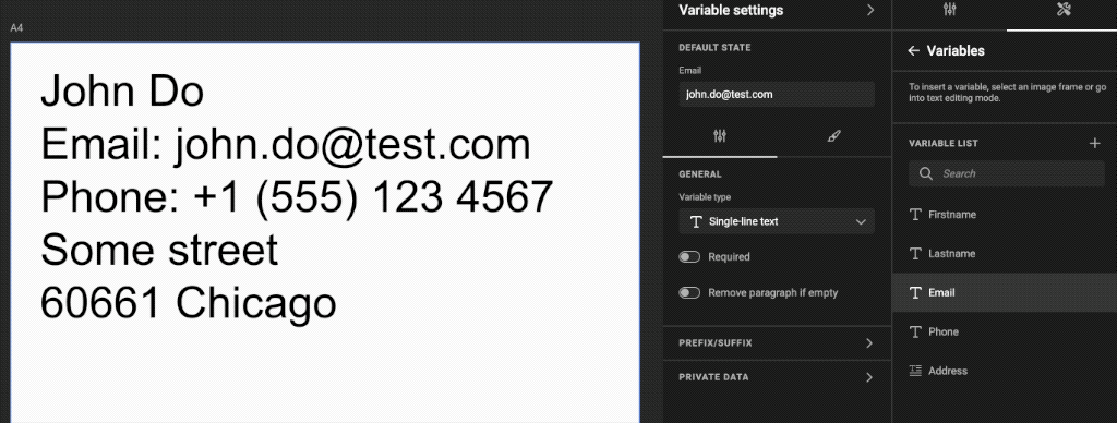
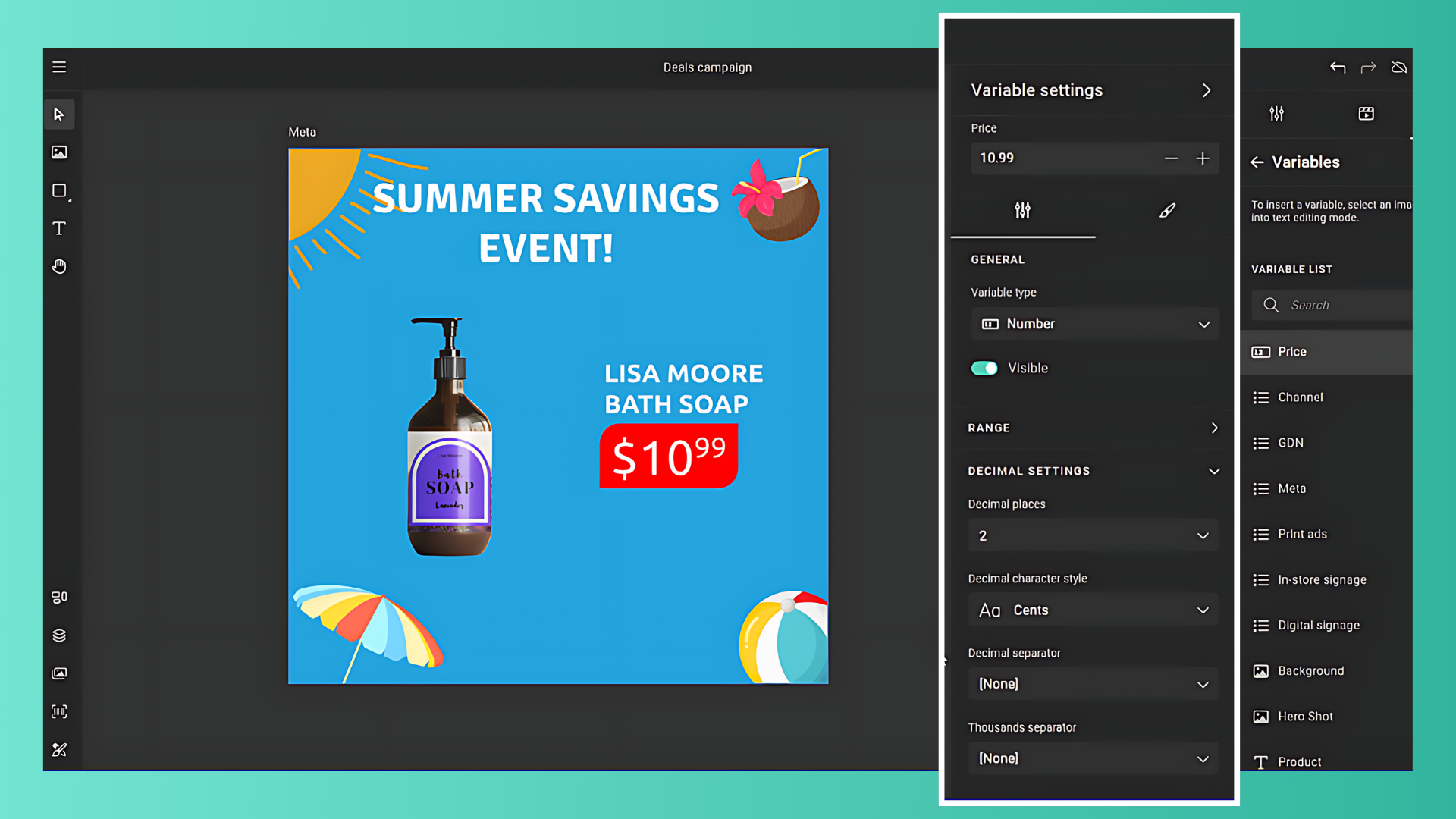
- Long layout and variable names are easier to read in their panels.
Bug Fixes
- Fixed canvas rendering in the space between the left panels.
- Fixed text selection in input fields using various mouse clicks.
- Fixed validation in particular input fields.
- Fixed text going into overflow with copyfitting and auto-grow enabled on multicolumn frames.
- Improved PDF generation performance.


