


The Curse of the Brand Font: When Typography Becomes a Religion
Every brand has its sacred font. It’s chosen carefully, blessed in a brand book, and protected by rules that sound almost theological.
Do not stretch it.
Do not substitute it.
Do not use it in Comic Sans.
Yet, every day, somewhere in the world, the commandments are broken.
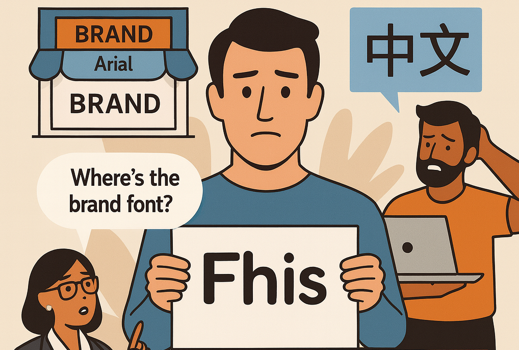
A store in Madrid prints a poster in Arial.
A social media manager in São Paulo swaps the typeface because “the file didn’t load.”
Someone in Tokyo discovers that the brand font doesn’t include Japanese characters and quietly picks a local alternative.
And the new intern in Warsaw, trying to help, finds a “free version” online that turns out to be an illegal clone.
The sacred font, the one that was supposed to unify the brand, begins to fracture.
For designers, these are daily battles. For marketers, they are invisible headaches. And for global brands, typography — the very thing meant to express identity—has become a constant, slow-moving crisis.
Fonts as identity — and as pain
Typography is not decoration; it’s personality in pixels. The font you choose says as much about your brand as your logo.
- Apple’s San Francisco feels modern, engineered, optimistic.
- IKEA’s Noto Sans is utilitarian and multilingual, designed to speak to everyone without shouting.
- McDonald’s custom Speedee Font is round, cheerful, and deliberately nostalgic.
These choices are not random. Fonts carry culture. The shape of a lowercase “a” or the spacing of a numeral can signal confidence or chaos.
But the larger a company grows, the more that personality starts to splinter. The same typeface that looks perfect in New York can fall apart in Bangkok or Riyadh.
In 2009, IKEA replaced its long-time companion Futura with Verdana, a font designed for digital screens. The reaction was instant outrage. Designers called it “a betrayal.” Blog headlines screamed “The death of good taste.” Yet IKEA’s reasoning was pragmatic: Verdana worked in 60 languages, across web and print, and didn’t require licensing gymnastics in every market. It was a functional decision masquerading as heresy.
The incident revealed a truth: for all our talk about creativity, typography inside corporations is mostly about logistics.
The global font problem
Fonts don’t travel well. Latin alphabets dominate Western design, but the world speaks in scripts that were never designed to fit neatly alongside them.
- Arabic scripts flow right to left and rely on connecting strokes that break in most Latin-based fonts.
- Chinese characters are complex logograms; even minimal styles require enormous file sizes and custom design.
- Cyrillic letters look similar to Latin ones but have different proportions that disrupt line spacing.
- Hindi’s Devanagari script includes vertical connectors that confuse digital layout tools.
Each region introduces new constraints: licensing, legibility, cultural expectations, and even political sensitivity.
When Coca-Cola expanded across Asia, it commissioned custom fonts for Chinese and Thai markets that mimicked the curvature of its Latin script. The goal wasn’t aesthetic perfection — it was emotional continuity. The brand needed to feel like Coca-Cola even when written in a different alphabet.
Smaller companies don’t have that luxury. They rely on “closest match” substitutes, which usually means Arial Unicode MS — a typographic equivalent of plain oatmeal.
The outcome is predictable: a brand that looks global on paper, but local teams quietly adjust fonts to survive day-to-day execution.
When licensing meets layout
Typography is also a business. Licensing fees for commercial use of premium fonts can reach tens of thousands of euros per year.
A global retailer with 40 markets might need 400 separate font licenses to stay compliant. Each agency partner has to manage its own access. One missed clause can mean a legal letter from the type foundry.
This complexity leads to corner-cutting. Agencies substitute “similar” fonts to avoid fees. Designers forget to embed fonts in PDFs, causing them to default to system fonts like Arial or Times New Roman when printed.
The result: reflowed text, broken headlines, and expensive reprints.
In 2021, a UK retailer spent over £250,000 correcting packaging after a font substitution changed the kerning of a key product line’s name. The error wasn’t noticed until after production.
Every marketing manager knows the sinking feeling of opening a proof and seeing the brand’s signature headline replaced by something just slightly… off.
The typographic priesthood
Because typography affects everything and touches everyone, brand teams become gatekeepers.
They issue guidelines with the tone of scripture:
- “Body copy must always be 12 pt Regular, leading 16 pt.”
- “Never track more than –20.”
- “Do not use the Light weight below 9 pt.”
These rules are essential, but they often evolve into bureaucracy. Designers are expected to be typographers, legal experts, and brand guardians simultaneously.
In large organizations, the enforcement becomes cultural. Every team has its own “font zealot,” the person who spots a kerning error at twenty paces and sends gentle but deadly emails like: “Hi, just noticed the spacing feels slightly inconsistent :)”
Meanwhile, speed-obsessed marketers bypass the rules entirely. They open Canva, choose a prebuilt template, and replace the headline. The brand font doesn’t load, so Canva substitutes something “similar.” The post goes live anyway.
It’s not malice; it’s momentum. Deadlines move faster than design governance.
The anatomy of a font failure
A single campaign can involve dozens of typography failures before it hits the public.
- Font mismatch: the local office doesn’t own the official font license.
- Substitution: the fallback font shifts line breaks, pushing the call-to-action out of frame.
- Localization: translations double word count in German or French, breaking the layout grid.
- Device rendering: the web version uses web-safe fonts; the print version doesn’t.
- Post-production: the image is edited in software that rasterizes text, making future edits impossible.
The outcome is a patchwork of near-misses. Individually, none seem disastrous. Collectively, they erode the brand’s visual credibility.
Typography, once the quiet backbone of design, becomes a source of operational drag.
How much does bad typography cost?
The data is rarely public, but internal audits from multinational brands suggest typography errors account for 10–20 % of all production rework.
In 2023, the global market for design operations software surpassed $9 billion (Source: Markets and Markets, 2024). A key driver? The cost of inconsistency. Every hour spent fixing text flow or font licenses is an hour not spent creating new content.
At enterprise scale, those hours add up to millions.
A 2022 Adobe survey found that 37 % of designers spend at least a quarter of their week correcting brand errors introduced by other teams. Typography is one of the top three culprits, behind imagery and color.
Fonts aren’t just aesthetic; they’re financial.
Why templates failed
Over the past decade, template-based design tools promised to solve this chaos. They democratized creativity, letting anyone produce branded content without professional training.
And they did — at least on the surface. But templates rely on static frames and simple substitution. They don’t understand why a font matters or how typography behaves across languages and platforms.
When a template breaks — because a translation overflows or a font doesn’t load—the user doesn’t fix the system; they just make it smaller, bolder, or different.
Templates standardize the process but not the intelligence.
Modern design at scale needs something else: systems that adapt typography contextually and automatically.
Toward intelligent typography
The next generation of design infrastructure treats fonts as data, not files.
Instead of storing “the brand font” in a style guide, the system understands its structure—its weight, width, x-height, language support, and fallbacks. It knows that Roboto in Thai requires different vertical metrics than in English. It knows that bold weights should be avoided below 10 pt in Japanese to maintain legibility.
This intelligence allows automation without chaos.
Imagine creating a global campaign where the headline automatically selects the right localized font, adjusts letter spacing for each script, and maintains the same visual rhythm everywhere—from a London billboard to a Korean e-commerce banner.
Designers still define the rules, but the execution becomes frictionless.
No one has to memorize whether the euro symbol needs a thin space before it in French or whether the Arabic version needs a reversed italic. The system knows.
That’s the quiet revolution happening under the surface of modern marketing production: design tools becoming design intelligence.
The economics of control
Why does this matter beyond aesthetics? Because scale magnifies mistakes.
A brand with 10,000 active SKUs, 30 markets, and weekly campaign cycles can easily produce 1–2 million unique design assets per year. If only 1 % contain typographic inconsistencies that require manual correction, that’s 20,000 files.
At an average of €25 per fix (agency rate), that’s half a million euros lost annually to spacing, substitution, and reformatting.
The return on intelligent design automation is not theoretical — it’s measurable.
Automation reduces rework, enforces licensing compliance, and prevents the silent drift of brand perception that happens when typography fractures.
The future of fonts that travel
Technology is finally catching up with the ambition of global design. Variable fonts now let a single file adapt to multiple weights and widths, cutting load times and storage. OpenType 1.9 supports dynamic axes that adjust for script differences. AI can detect when a fallback font doesn’t visually match the brand style and recommend a closer alternative before export.
These aren’t futuristic concepts—they’re production realities in 2025.
For global marketing teams, it means typography can finally scale without sacrificing soul. The brand font can travel.
And for the designers who’ve spent years manually policing commas, kerning, and licenses, it means something even better: sleep.
The human side of the curse
Fonts inspire irrational loyalty because they’re emotional artifacts. Designers spend months crafting a logotype, fine-tuning how a lowercase “e” curves into an “r.” Seeing that replaced with Arial feels like vandalism.
But control has its limits. A font designed in Berlin can’t anticipate how it will feel on a billboard in Mumbai. A single global standard often alienates local nuance.
The future of brand typography isn’t uniformity — it’s intelligent flexibility.
Systems should protect what makes a brand recognizable while allowing space for cultural translation. That’s how real connection happens.
Closing – let fonts live
Typography was never meant to be worshiped. It was meant to communicate.
The real curse of the brand font is thinking it must remain frozen forever, identical in every market and medium.
Modern design systems can keep the spirit consistent while letting the execution breathe. They can prevent errors without killing creativity.
So maybe it’s time to retire the brand bible and replace it with something smarter—a living, adaptive framework that understands the brand as a language, not a law.
Because the font isn’t divine. It’s human. And humans, thankfully, evolve.
CEO insights

Kevin Goeminne
Oct 16, 2025
Sign up for blog updates
Related articles


